Designing Infographics opens the door to a world of creative storytelling through visuals. Get ready to dive into the art of combining data and design in a way that captivates and informs like never before.
Understanding the Basics of Infographics: Designing Infographics
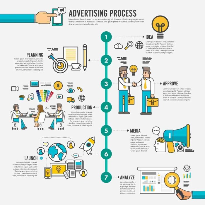
Infographics are visual representations of information that help simplify complex data and make it easier for people to understand. They are powerful tools in communication as they combine text, images, and design elements to convey a message effectively.
Purpose of Infographics in Communication
Infographics are used to grab the audience’s attention quickly and engage them with interesting and easily digestible content. They help break down information into visual chunks, making it more memorable and shareable.
Elements in Infographic Design
- Charts and graphs: Visual representations of data to show trends or comparisons.
- Icons and illustrations: Graphics that represent concepts or ideas in a simple and engaging way.
- Text: Concise and informative text to complement the visuals and provide context.
- Color scheme: Use of colors to attract attention, create hierarchy, and evoke emotions.
- Layout: Organizing elements in a visually appealing and logical manner to guide the viewer’s eye.
Examples of Effective Infographic Designs
- In the health industry: Infographics showing statistics on diseases, prevention tips, or healthy living habits.
- In the technology industry: Infographics explaining complex processes, software comparisons, or future trends.
- In the travel industry: Infographics showcasing travel destinations, packing tips, or travel hacks.
Design Principles for Infographics
Color schemes play a crucial role in infographic design as they help in conveying the message effectively and creating visual appeal. The right combination of colors can evoke emotions, highlight important information, and make the infographic more engaging for the audience.
Importance of Color Schemes
- Choose a color palette that aligns with the brand or topic of the infographic to maintain consistency and enhance recognition.
- Use contrasting colors to make important data points or sections stand out and create visual hierarchy.
- Avoid using too many colors as it can overwhelm the viewer and make the infographic look cluttered.
- Consider color accessibility for color-blind individuals by using tools to check color contrast and readability.
Choosing the Right Fonts
- Select fonts that are easy to read and complement the overall design of the infographic.
- Use a maximum of two to three different fonts to maintain consistency and readability.
- Ensure that the font size is appropriate for different sections of the infographic, with larger fonts for headings and smaller fonts for body text.
- Experiment with font styles like bold, italic, or underline to emphasize key points and add visual interest.
Role of Visual Hierarchy
- Establish a clear visual hierarchy by using different font sizes, colors, and styles to guide the viewer’s eye through the infographic.
- Place important information or data points in prominent positions to draw attention and create a logical flow of information.
- Utilize visual elements such as icons, illustrations, or charts to break up text-heavy sections and make the content more digestible.
- Consistently apply visual hierarchy principles across the infographic to ensure coherence and effectiveness in communication.
Data Visualization Techniques

Data visualization techniques are essential for creating effective infographics that convey information clearly and engagingly. By representing data visually, complex information can be simplified and understood more easily by the audience. Let’s explore some common ways to visualize data in infographics.
Charts and Graphs, Designing Infographics
- Bar Charts: Used to compare different categories or show changes over time.
- Line Graphs: Ideal for showing trends or changes in data over a period.
- Pie Charts: Useful for illustrating proportions or percentages of a whole.
- Infographics: Combining text, images, and data visualizations for a comprehensive overview.
Best Practices for Data Incorporation
- Avoid clutter: Keep the design clean and uncluttered to prevent confusion.
- Use appropriate colors: Select a color scheme that enhances readability and highlights key points.
- Provide context: Include labels, legends, and captions to help viewers understand the data.
- Choose the right visualization: Select the most suitable chart or graph type based on the data being presented.
- Accuracy is key: Ensure that data points are accurate and properly represented to maintain credibility.
Tools and Software for Creating Infographics

Creating visually appealing and engaging infographics requires the right tools and software. Let’s explore some popular options and tips for beginners on selecting the right tool for their infographic projects.
Popular Tools for Infographic Design
- Canva: A user-friendly platform with a wide range of templates and design elements for creating stunning infographics.
- Adobe Illustrator: Ideal for more advanced users, offering extensive customization options and flexibility in design.
- Venngage: Known for its interactive features and easy-to-use interface, suitable for beginners and professionals alike.
- Piktochart: Offers a variety of pre-designed templates and drag-and-drop tools for quick infographic creation.
Comparing Infographic Design Platforms
- Canva vs. Adobe Illustrator: Canva is more beginner-friendly, while Adobe Illustrator provides more advanced design capabilities.
- Venngage vs. Piktochart: Venngage is known for its interactive features, while Piktochart offers a straightforward approach to infographic design.
Tips for Beginners in Selecting the Right Tool
- Consider your design skills: Choose a tool that aligns with your proficiency level, whether you’re a beginner or an experienced designer.
- Explore templates: Look for platforms with a variety of templates to jumpstart your infographic creation process.
- Check pricing: Some tools offer free versions with limited features, while others require a subscription for full access.
- Read reviews: Research user feedback and reviews to understand the pros and cons of each tool before making a decision.